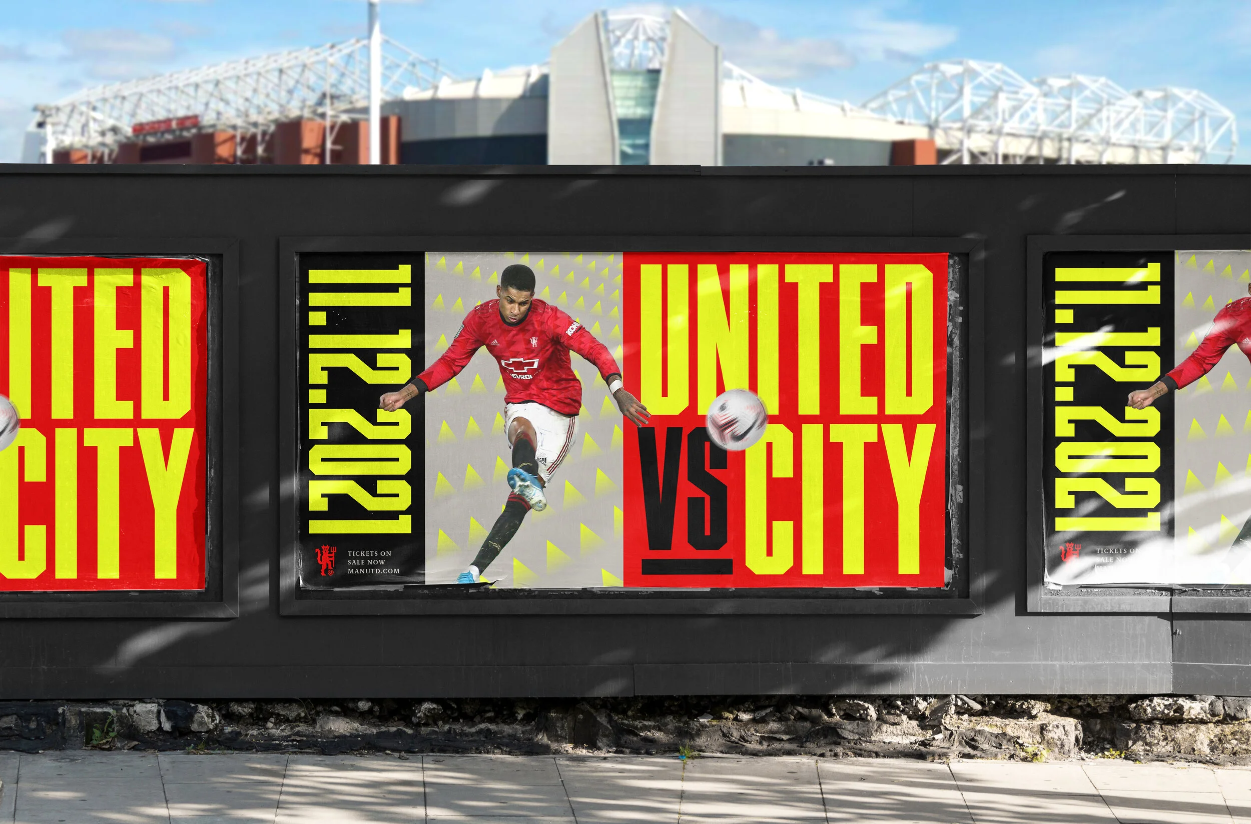
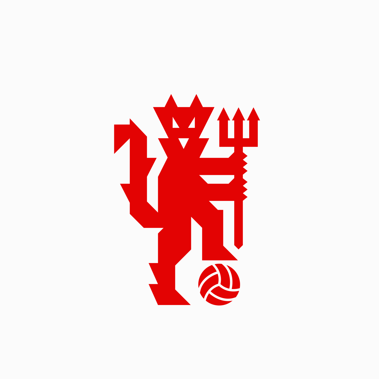
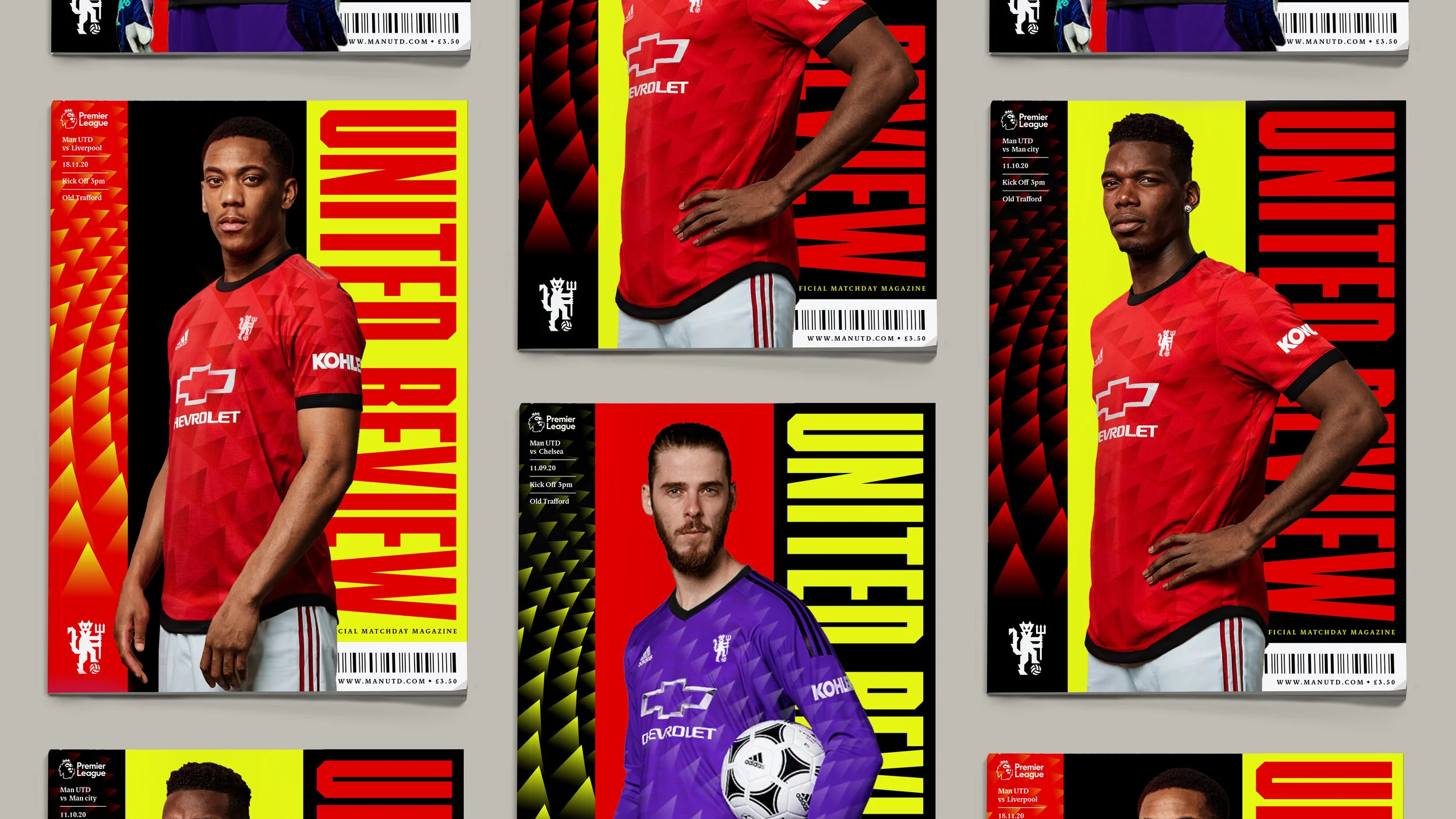
Having been a lifelong Manchester United fan I have always wondered what the future may hold for their graphic identity. The United crest is a mark that I have spent almost my whole life admiring and have looked at more than any other, so refreshing the clubs crest was a delicate and painstaking task.
The reimagined graphic identity is inspired by the sharp geometry of the devil and its pitchfork. This conceptual evolution lends itself to a bolder and braver approach to a universally recognised icon in the Red Devil while still respecting the heritage of the club.
Dated: November 2020
(Please note: This concept is in no way affiliated with Manchester United - It is a conceptual project)